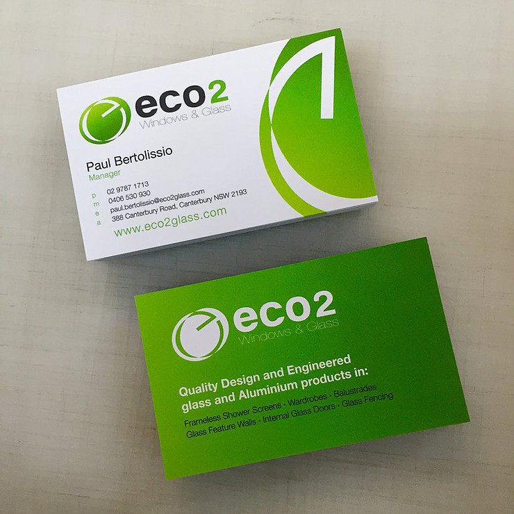
A good business card is not just a tool for giving your information out to prospects but an opportunity to connect with a new prospect on a personal level. For that reason, good business cards will never be replaced by any of the digital networking tools at our disposal, because digital tools lack the human factor of the equation.
A good business card is an extension of your brand that conveys the right information about who you are and what you do in a memorable, powerful, and meaningful way.
Start with a high-quality business card template or custom design, which gives you the right foundation to build from. With a good design in hand, you then need to customize it — adding key details to your card.
So, what information should be on a business card?
1. Logo and Tagline
Before you even think about what information goes on your business cards, you need to make sure you include your logo and tagline. As an extension of your brand, your business card needs to convey your business identity (through the shapes, colors, and words it features) to prospects.
Anyone holding your business card between their fingers should be able to identify your brand and instantly recognize wherever they may see it in the future as well, be that on your website, your portfolio, your newsletter, or even you brick-and-mortar shop or studio.
2. Name and Functional Job Title
Seems obvious, doesn’t it? But you’d be surprised how many people get this wrong. First the name. If your name is David but prefer to be called Dave or even Steve (for some odd reason), put the latter on your card, not the former.
A business card isn’t meant to provide your genealogical information but introduce you to people who may be interested in talking to you. Introduce yourself as you like to be called to avoid awkward re-introductions later.
What about your job title?
As a freelancer, entrepreneur, or small business owner you probably wear many hats in your business. Which one do you note on your business cards? Use the one that describes your main function in the business — where function means the work prospects may hire you to do.
3. Contact Information
Contact information is the meat of a business card. If you want people to contact you, you have to tell them how. But which of all your contact info should you include? The key word to keep in mind here is “direct.”
By the very nature of being passed on from hand to hand (preferably while making eye contact), business cards create a personal connection between you and prospects. You don’t want to break that connection by providing prospects with a generic info @ DomainName . com email or a general phone line where they must go through a digital menu and three different operators before reaching you.
On the other end of the spectrum, however, you don’t want to go so personal as to give your house number where your 5-year-old might answer the phone, or your personal email address hosted @gmail.com. That’s simply unprofessional.
Always give your direct contact information as a professional, rather than a business, while keeping your personal information private.
Should you include a physical street address? Only if you have a brick-and-mortar shop or studio whose physical location is crucial to doing business. If you’re a photographer, for example, who shoots people around your location, you should at least include your state on the card.
If you’re a copywriter, however, who works from wherever there’s internet, there’s no point in giving anyone your registered business address. It’s simply irrelevant.
4. Your Website, But Not Your Homepage
What’s the purpose of putting your web address on your business cards? Not simply to show people you have one. That’s almost a given these days. Hopefully, interested prospects will be so impressed by your business cards that as soon as they go home, they’ll be typing your website into their browsers to find out more about you. So why not send them to a page with that purpose?
Create a page with a welcoming message or record a short, fun introductory video where people get to know you better and understand how you can help them. Put a special offer on there for them or have a little bonus they can download as a thank you for connecting with you. In short, send prospects to a page that deepens the connection you’ve created with them in person while giving out your card.
5. Social Media Profiles
Include your social media profiles on your business card. But not all of them. Social media channels have become indispensable parts of both traditional and virtual businesses. If you’re not on social media, you don’t exist in the eyes of your customers. Quite literally.
That doesn’t mean; however, you should list all eight or however many social media accounts you have on your business card. First, because of the simple design rule in Tip 6 to follow.
Second, you want to give prospects the opportunity to connect with you, not overwhelm them with your presence. Be strategic about your social media listings and list only the few channels where prospects can get a good taste of your work.
6. White Space
Yes, white space is so important it gets its own tip on the list. How many times where you handed a business card that was so absolutely overstuffed with information it made you feel nauseous just looking at it? Remember, the point of business cards is not to overwhelm prospects but to invite them to connect with you. And clutter invites no one.
White space doesn’t have to be the color “white” of course. It just means there must be empty space on your card for the information (and your prospect looking at it) to breathe easily. Check out these awesome minimalist business card designs that contain all the necessary info without unnecessary clutter.
7. Creativity
This final tip is the be-all end-all and the holy grail of business card designs. All the above tips fall under the category of practical advice for best results. Yet, even if you follow those to the letter, but form them into the most commonplace and boring presentation (that we’ve all seen a thousand times before), no one will be contacting you anytime soon. No matter how many cards you give out.
You need to get creative with your presentation in a way that expresses you!
Show people what you do through your card design rather than simply tell them through your job title. If you’re in the music industry, for example, you could use a business card designed like a digital turntable or a classic piano template depending on how you make your music.
If you’re a photographer, you may choose a modern camera card design, or go for something with a more classic (but still creative) design, if that expresses your brand better, such as this photographer business card.
Whatever you decide to do, and for the sake of everything that’s good in business, don’t be bland! Give people a reason to contact you—even if just to say, “I loved your business cards so much I just had to call you!” You can always deepen the connection from there.


Leave A Comment